Charts
View charts detailing important metrics about your app's subscription performance, paywalls, users, and revenue.
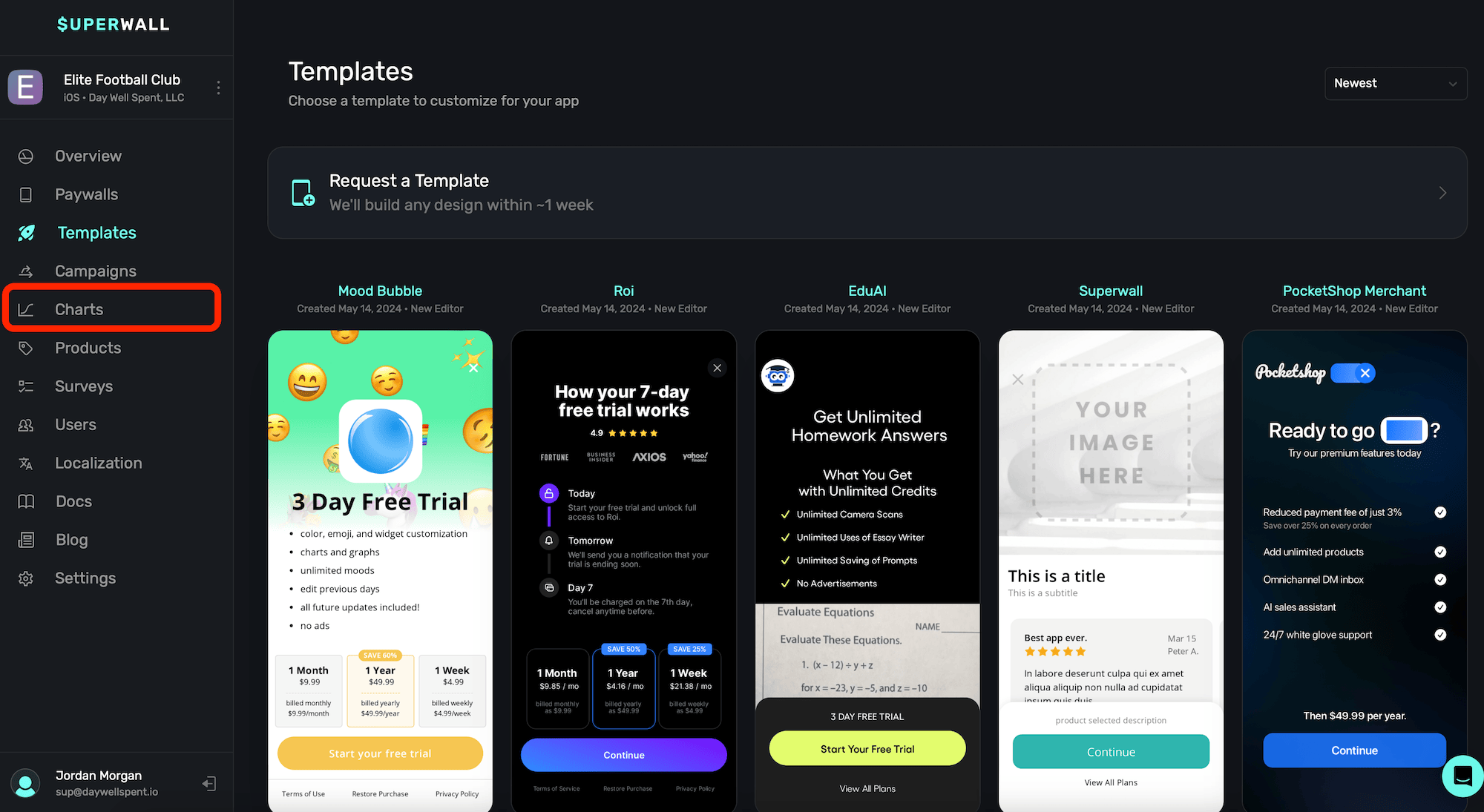
To view charts breaking down your app's performance, click the Charts button in the sidebar:
Check out a video overview of our charts on YouTube.
Chart types
Choose between different charts by making a selection from the left sidebar:
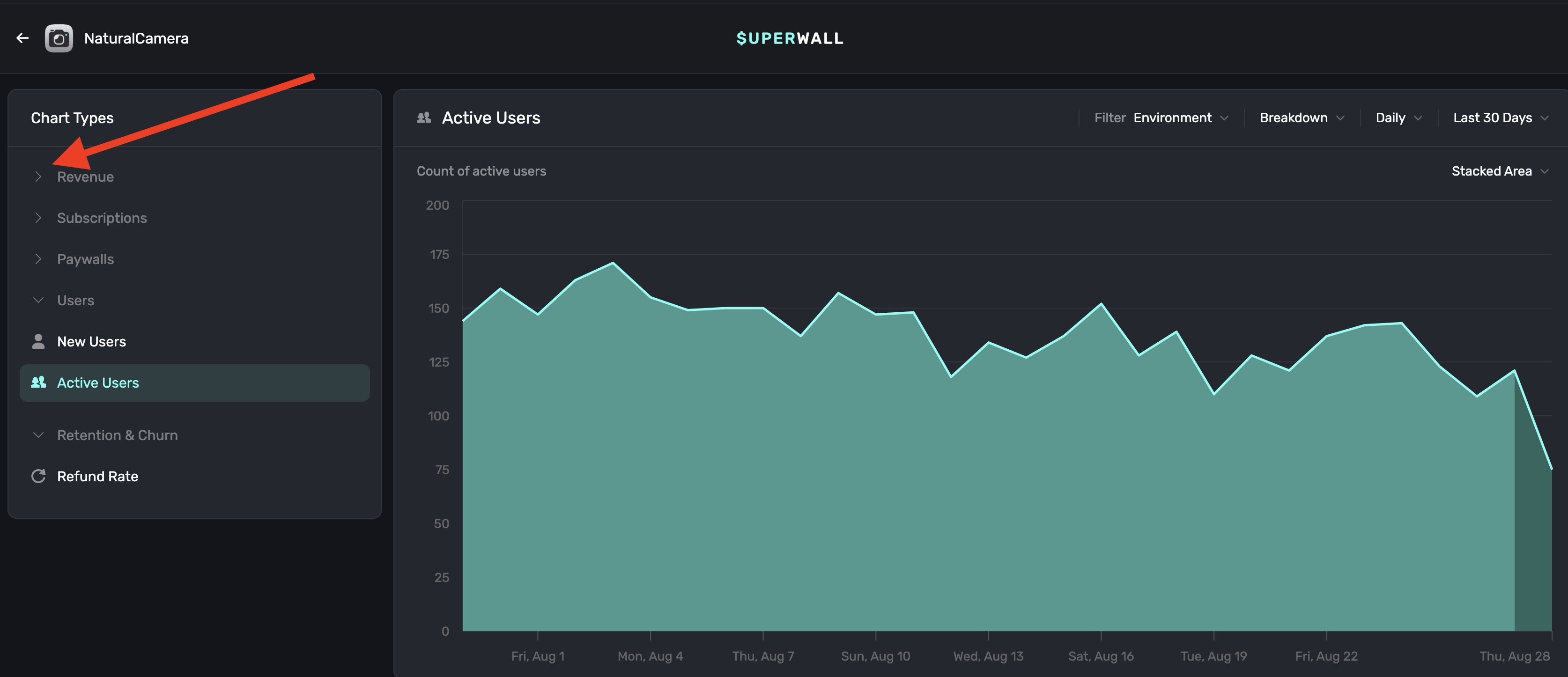
Currently, we offer the following charts:
Revenue Charts
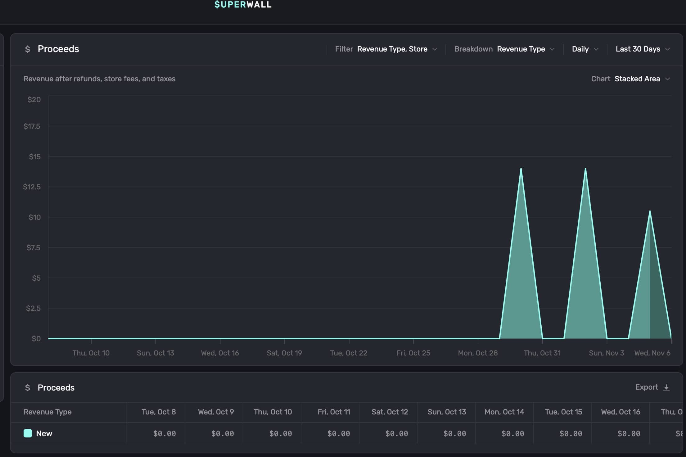
- Proceeds: Revenue after refunds, store fees, and taxes.
- Sales: Revenue before refunds, taxes, and fees.
- Cohorted Proceeds: Net proceeds cohorted by install date, after refunds, taxes, and fees.
- ARR: Annualized recurring revenue from subscriptions.
- MRR: Monthly recurring revenue from subscriptions.
- Realized LTV per new user: Net proceeds per new user, cohorted by install date.
- Realized LTV per paid user: Net proceeds per paying user, cohorted by install date.
Subscription Charts
- Active Subscriptions: Count of unexpired, paid subscriptions.
- Paid Conversion: Percent of installs who became paying users.
- New Trials: Trial starts, cohorted by trial start date.
- Trial Conversion: Percentage of trials that converted to paid subscriptions.
- New Subscriptions: New subscriptions, cohorted by subscription start date.
- Auto Renew Status: How much of your MRR is set to renew versus churn.
Paywall Charts
- Initial Conversion: Percent of new users who converted on a paywall.
- Paywalled Users: Count of unique users who opened paywalls.
- Paywall Rate: Percent of new users who opened paywalls.
- Paywall Conversion: Percent of users who converted after opening a paywall.
- Conversions: Count of completed transactions.
- Checkout Conversion: Percentage of users who converted after starting checkout.
User Charts
- New Users: Count of new users.
- Active Users: Count of active users.
Retention & Churn Charts
- Subscriber Churn: Percentage of paid subscriptions that expired in each period.
- Refund Rate: Ratio of refunds to gross proceeds, cohorted by first purchase date.
- Subscription Retention: Subscription retention by cohort over time.
Filtering chart data
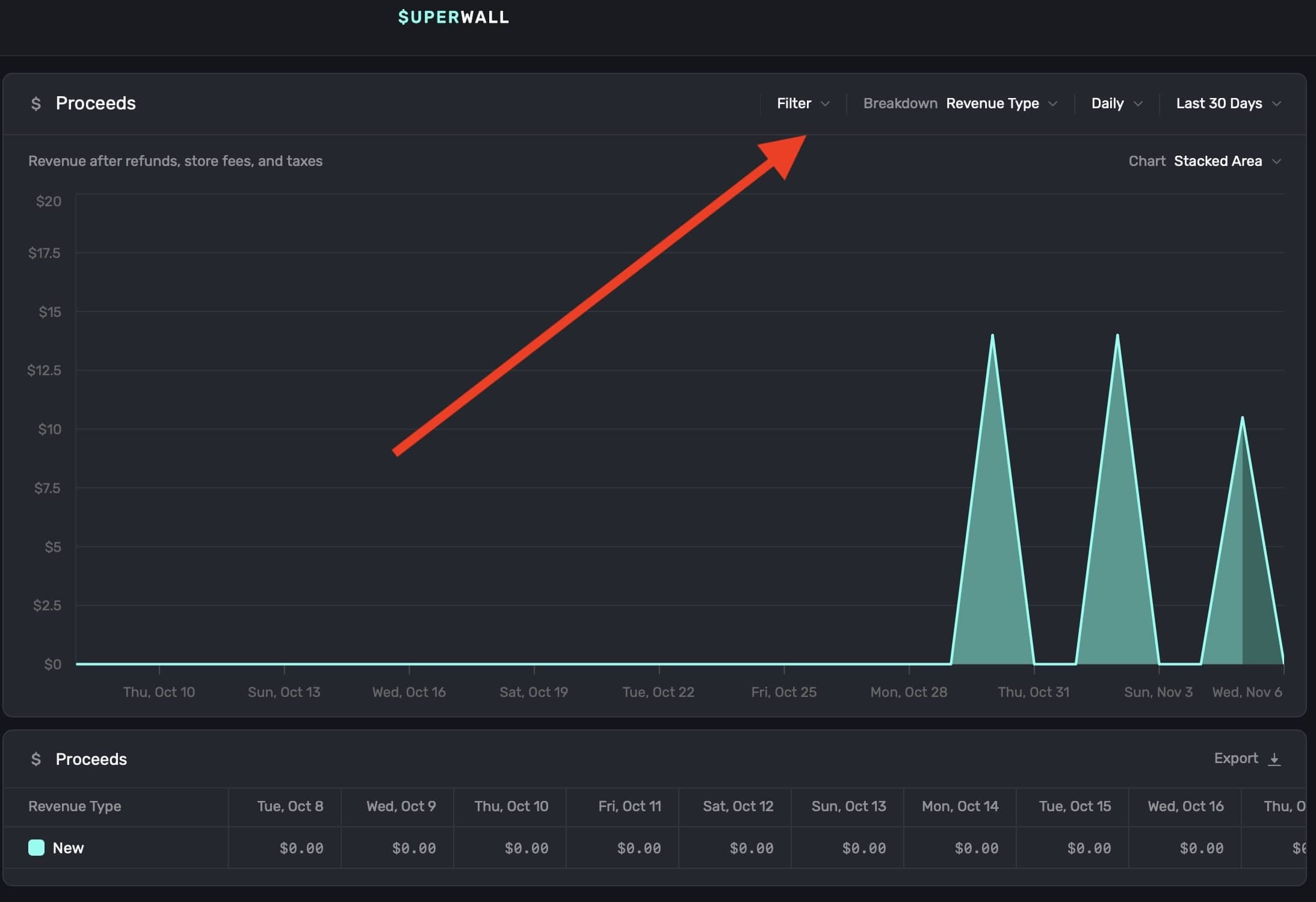
To filter data on a chart, click the Filter button at the top right:
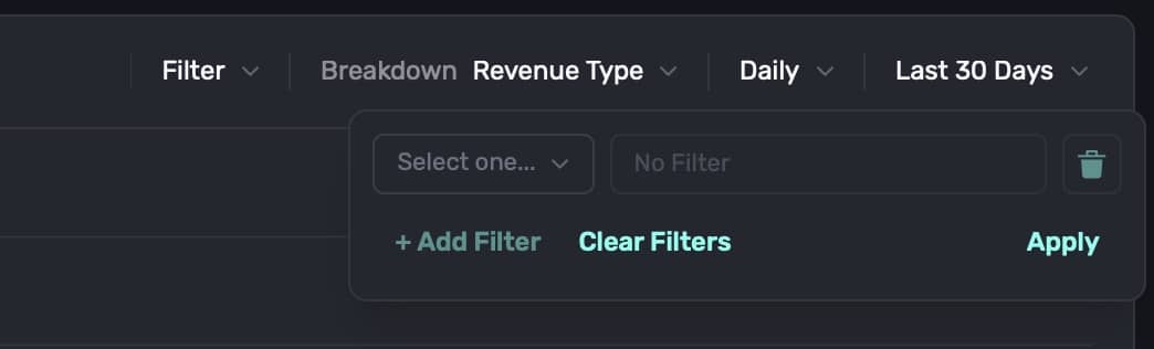
Filter data by choosing a filter type and clicking on + Add Filter to apply it. You can add one, or several, filters:
When you're done, click on the Apply button, and the chart will refresh with the data filtered by your selections:
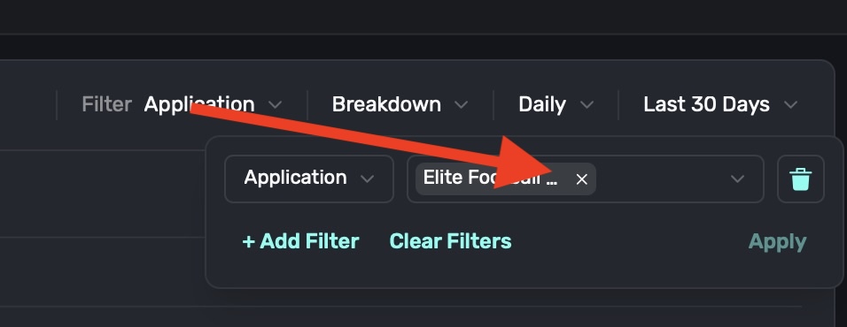
To remove an individual filter, click on the trash can icon on the trailing side of it:
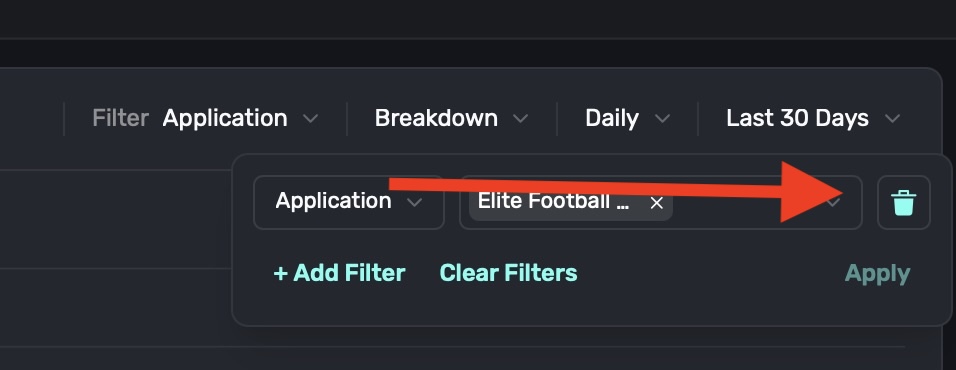
To remove an individual component that's part of a filter, such as breaking down by Application and removing one included app, click on the X button on its trailing side:
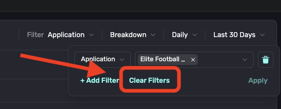
To remove all filters, click on the Clear Filters button:
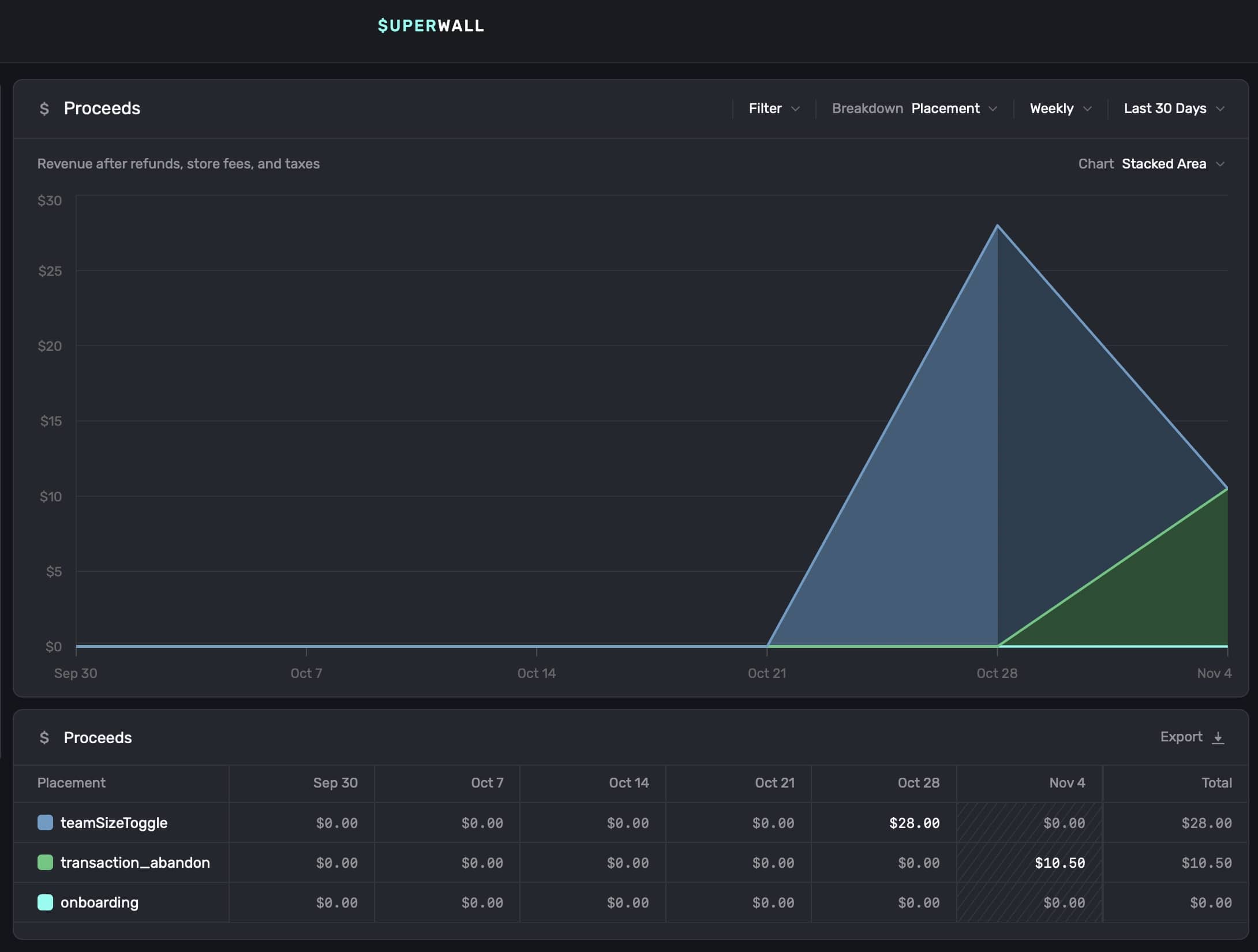
Breaking down chart data
To break down data in a chart, click the Breakdown toggle at the top right:
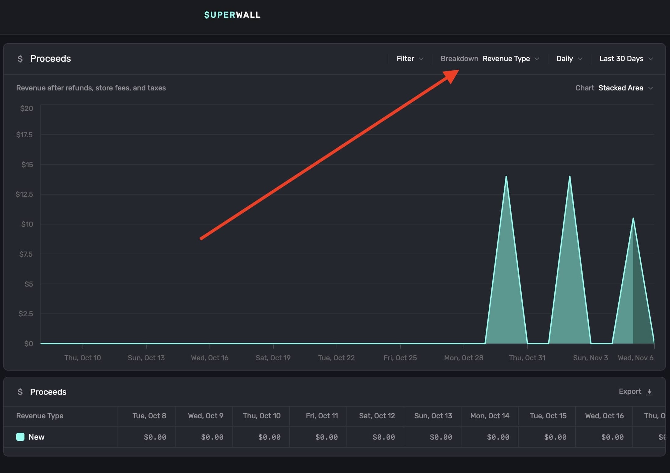
The breakdowns available are tailored to the type of chart you have selected. After you apply a selection, the chart and the table below it update automatically:
Selecting time ranges
To customize the time span and level of detail of the data displayed on the chart, use the two date toggles at the top right:
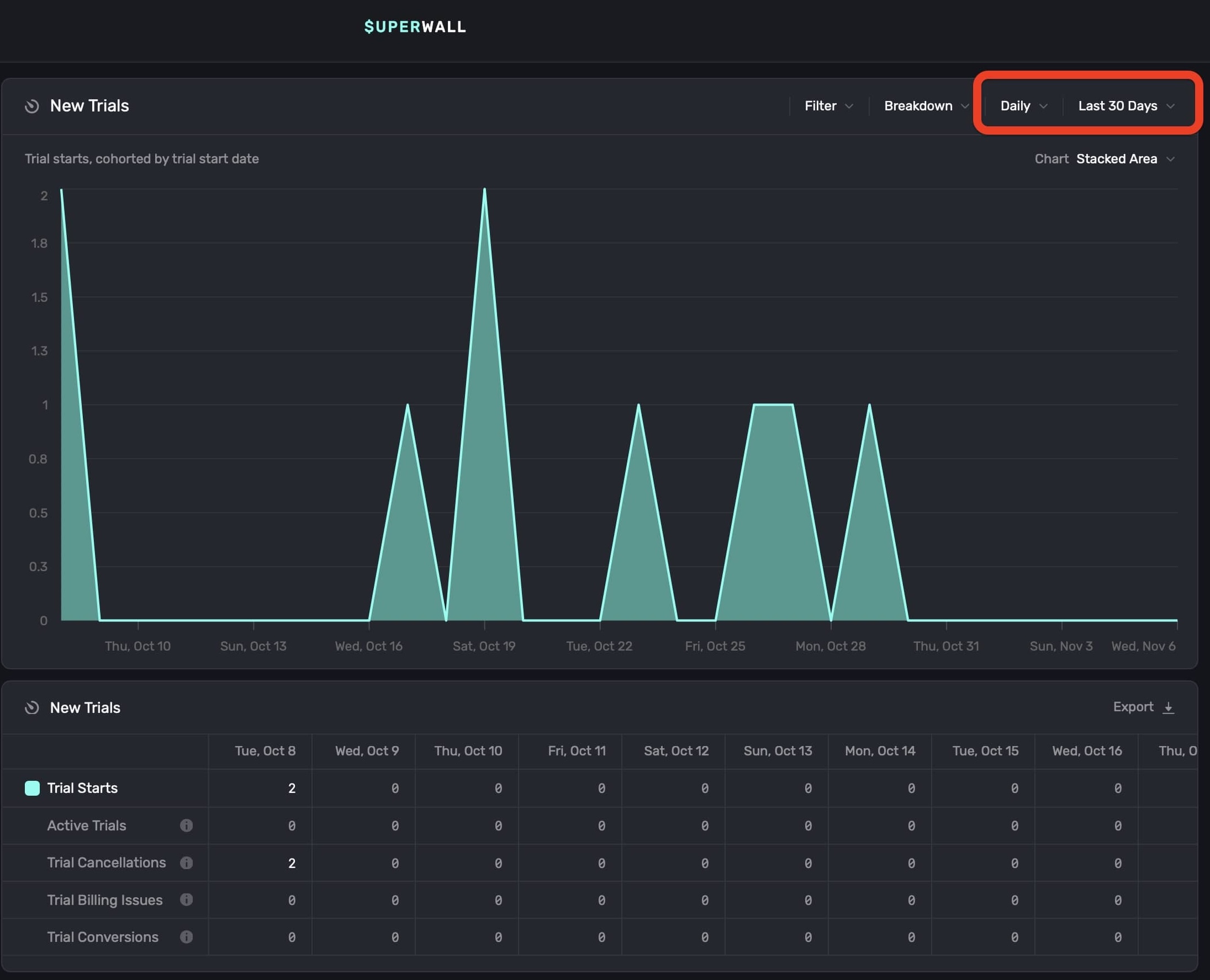
These controls adjust the chart's view interval and data range:
Display Interval: Sets the interval at which data is displayed on the chart. Choose options like hourly, daily, weekly, or monthly to adjust how granular the chart appears. Selecting Auto automatically optimizes the interval based on the selected date range.
Data Fetch Range: Defines the total date range used to populate the chart. Options include Yesterday, Last 7 Days, Last 30 Days, and more.
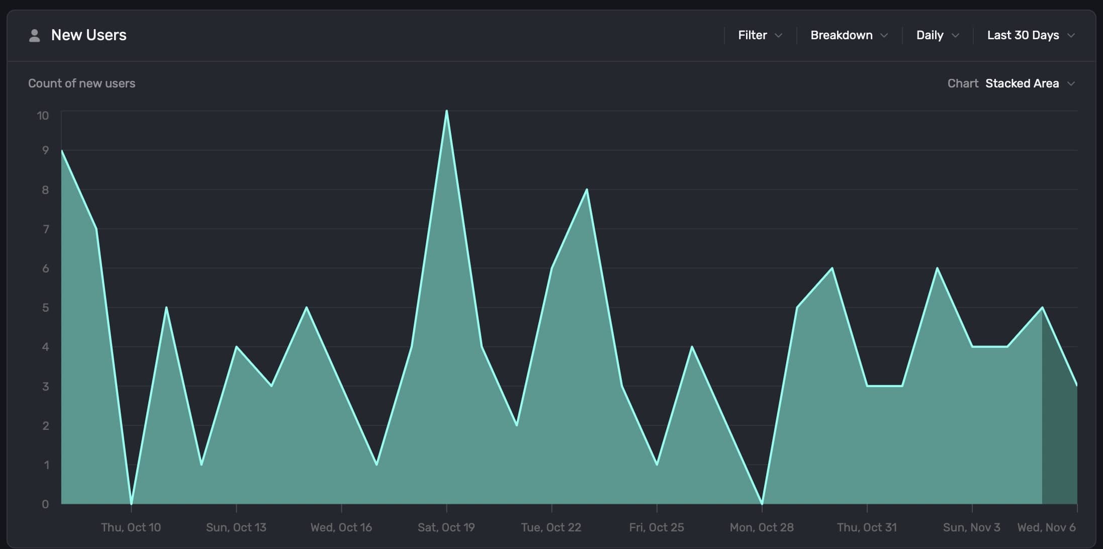
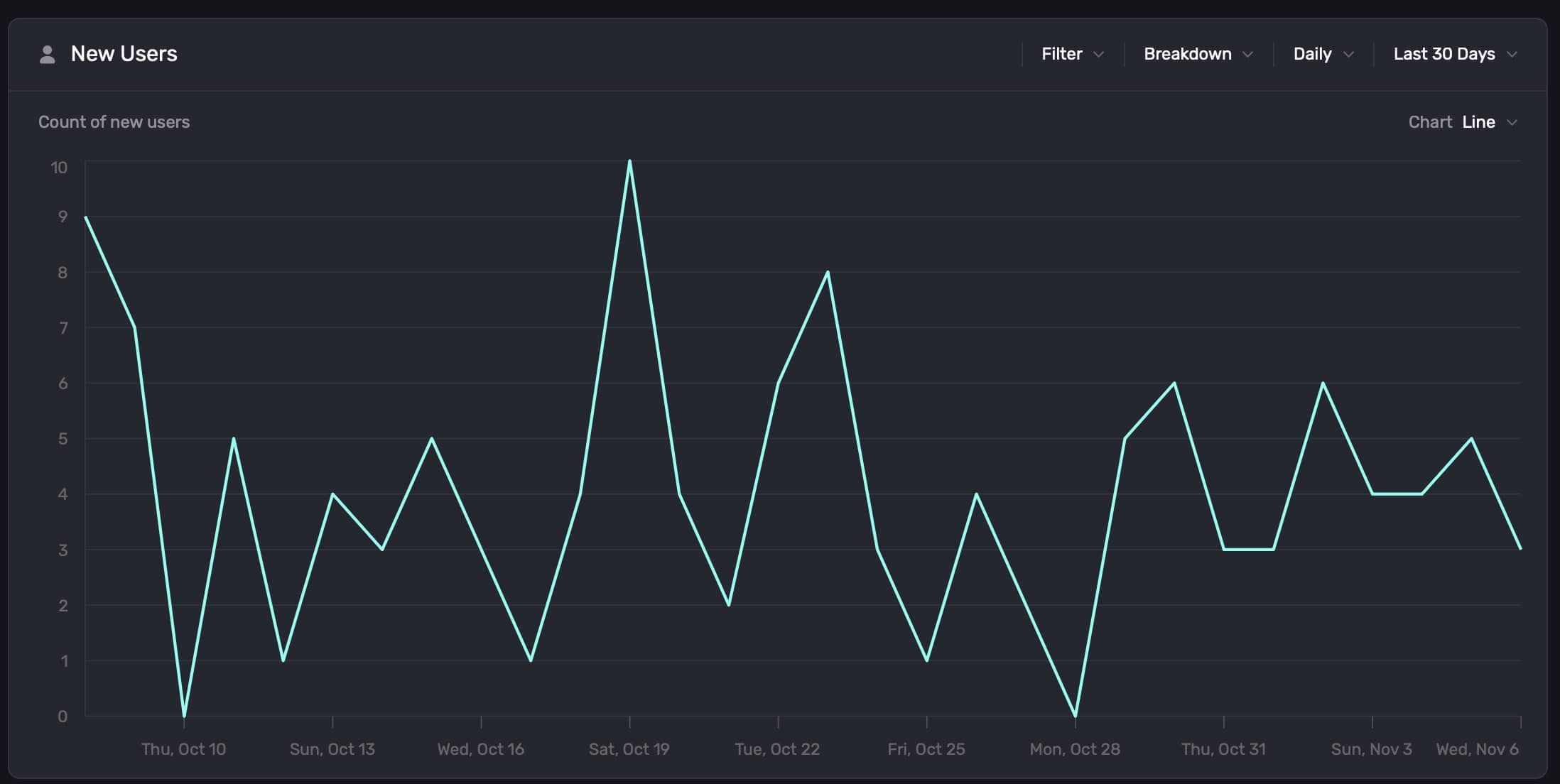
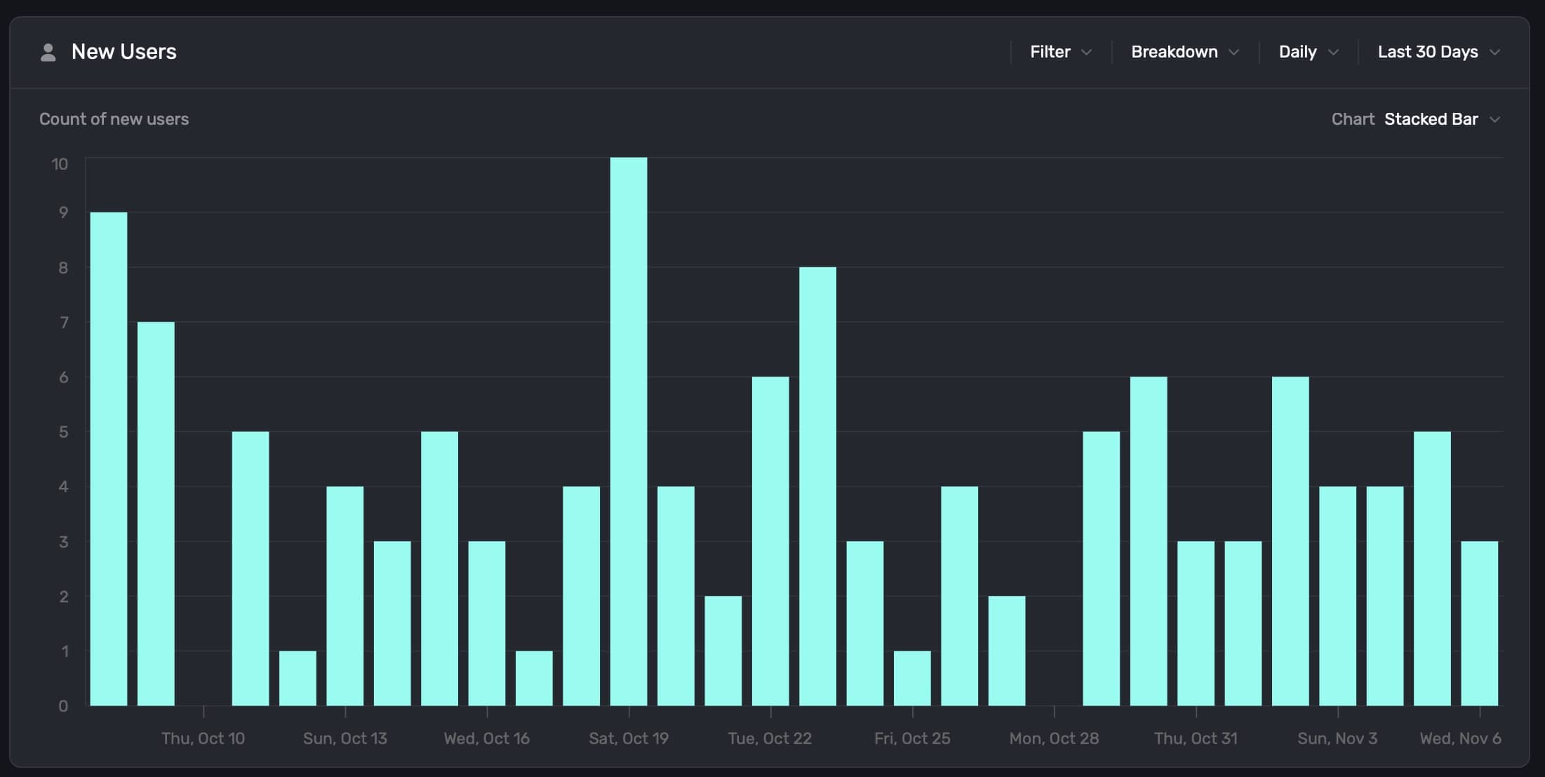
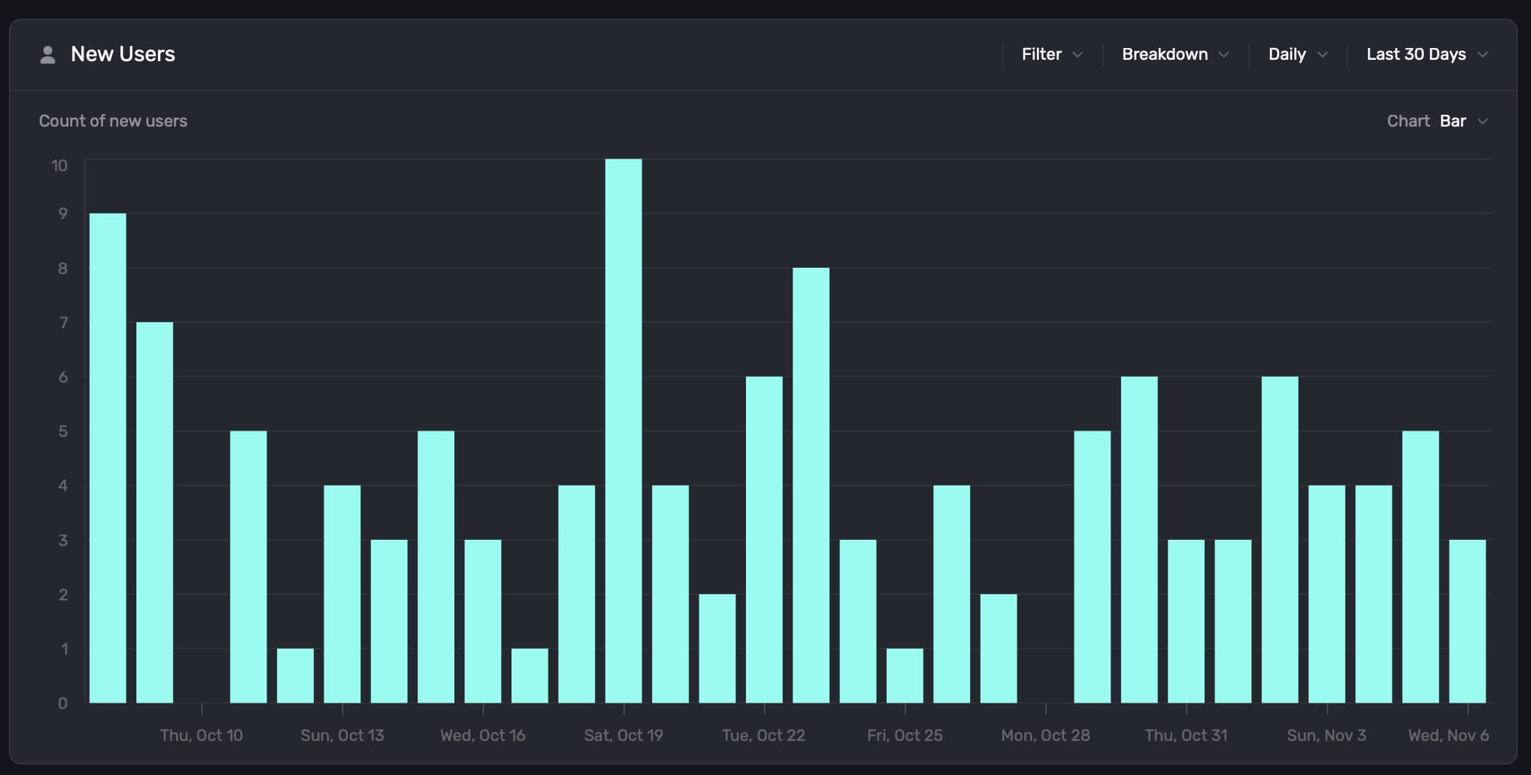
Changing chart formats
Each chart type can display its data in different chart formats. To change the default display, click on the Chart button found at the top right:
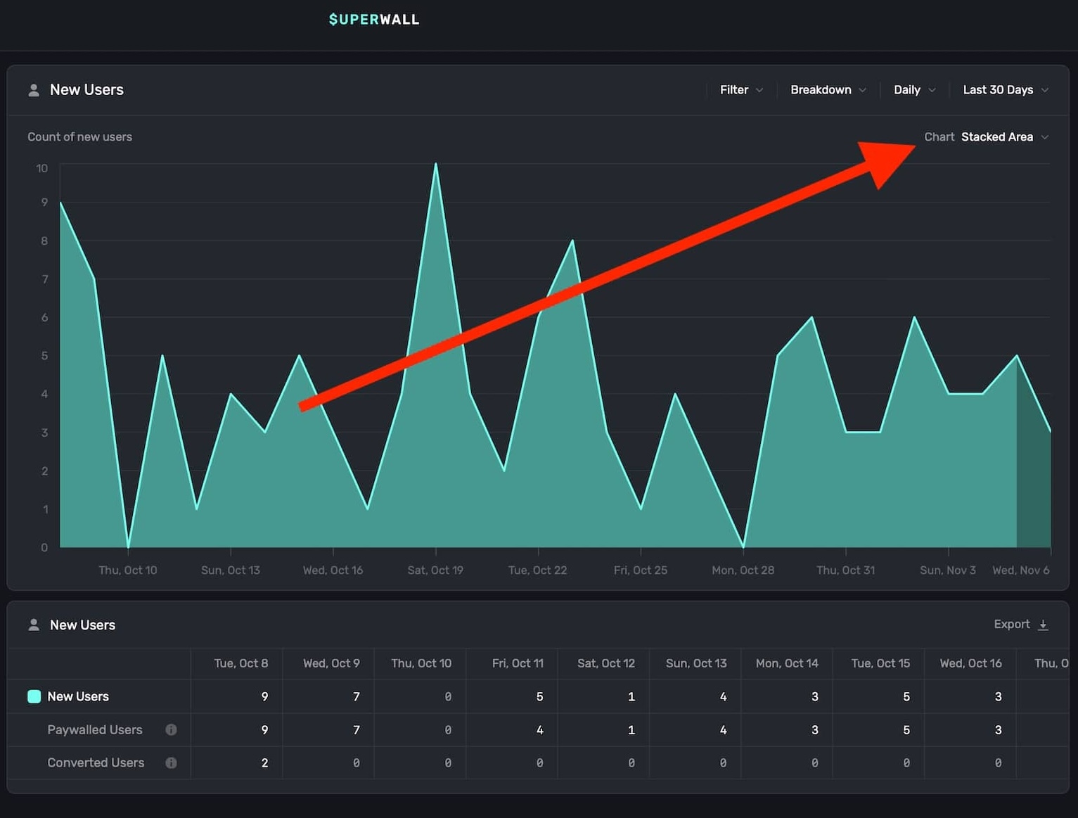
You can toggle the chart format between Stacked Area, Line, Stacked Bar, or Bar. Here is the same chart data in each format:
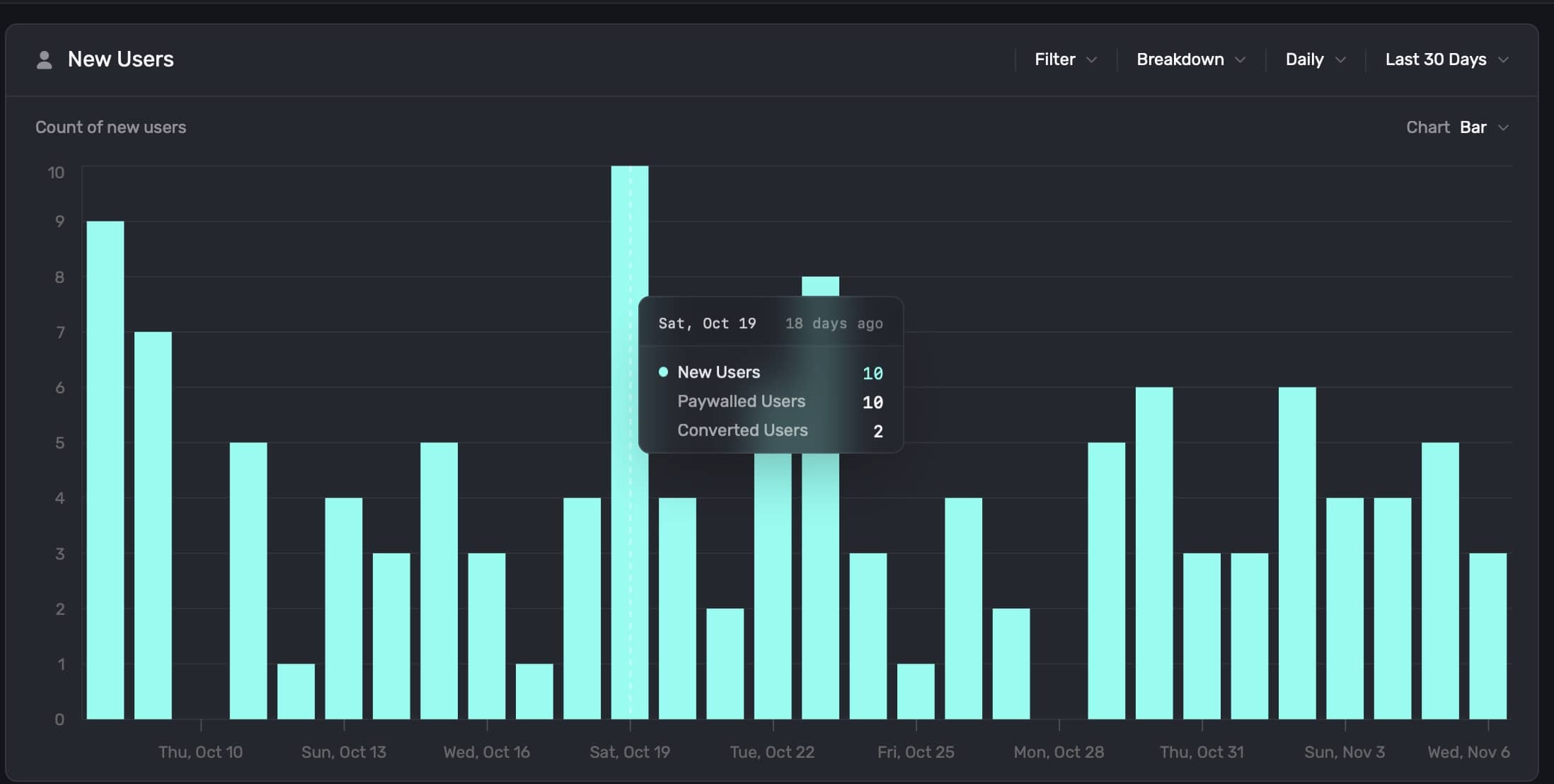
Additionally, you can hover any chart element to see more details about the data point:
Exporting chart data
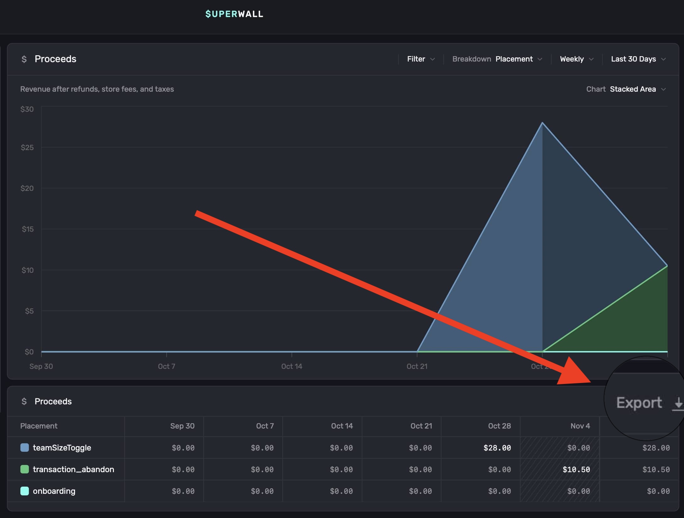
You can export any chart data as a .csv file. Just click the Export button at the bottom-right of any chart:
How is this guide?